Unleashing the Power of Colors: Finding the Perfect Palette for Your Brand
In this post, we're going to dig deep into an essential element in the field of design and branding: Colors. Understanding and choosing the right color palette for your brand could be the defining factor for your brand's success.
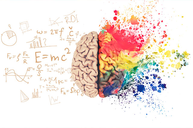
Colors have a profound impact on people’s emotions and perceptions. Imagine a brand without a distinct color hue. It will not only be difficult for the audience to recognize your brand, but it might also fail to evoke certain emotions or convey your brand's message. Discovering ‘color psychology’ will assist in drawing your desired consumer response while nurturing brand identity.
So, without further ado, let's dive into the wonderful world of colors and find out how you can choose the perfect palette for your brand.
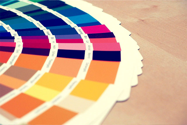
UNDERSTAND COLOR PSYCHOLOGY
Color psychology is the study of hues and their impact on human behavior. Understanding this becomes crucial when choosing a color palette as different colors evoke distinct perceptions and emotions. For instance, red is associated with passion and urgency, while blue represents trust and reliability. Align your brand message with the right colors to make it more resonant.
IDENTIFY YOUR TARGET AUDIENCE
Knowing who your target audience is crucial in selecting a color palette. Different age groups, genders, and cultures perceive colors differently. For instance, a younger audience might be drawn to vibrant, bold colors, while an older audience might prefer softer and more subtle hues. Confirm your brand palette aligns with the preferences of your target audience.
STUDY YOUR COMPETITORS
Analyzing your competitors' color choices can provide valuable insights and ensure you don’t blend in or copy inadvertently. Your aim should be to distinguish yourself, making your brand memorable and instantly recognizable.
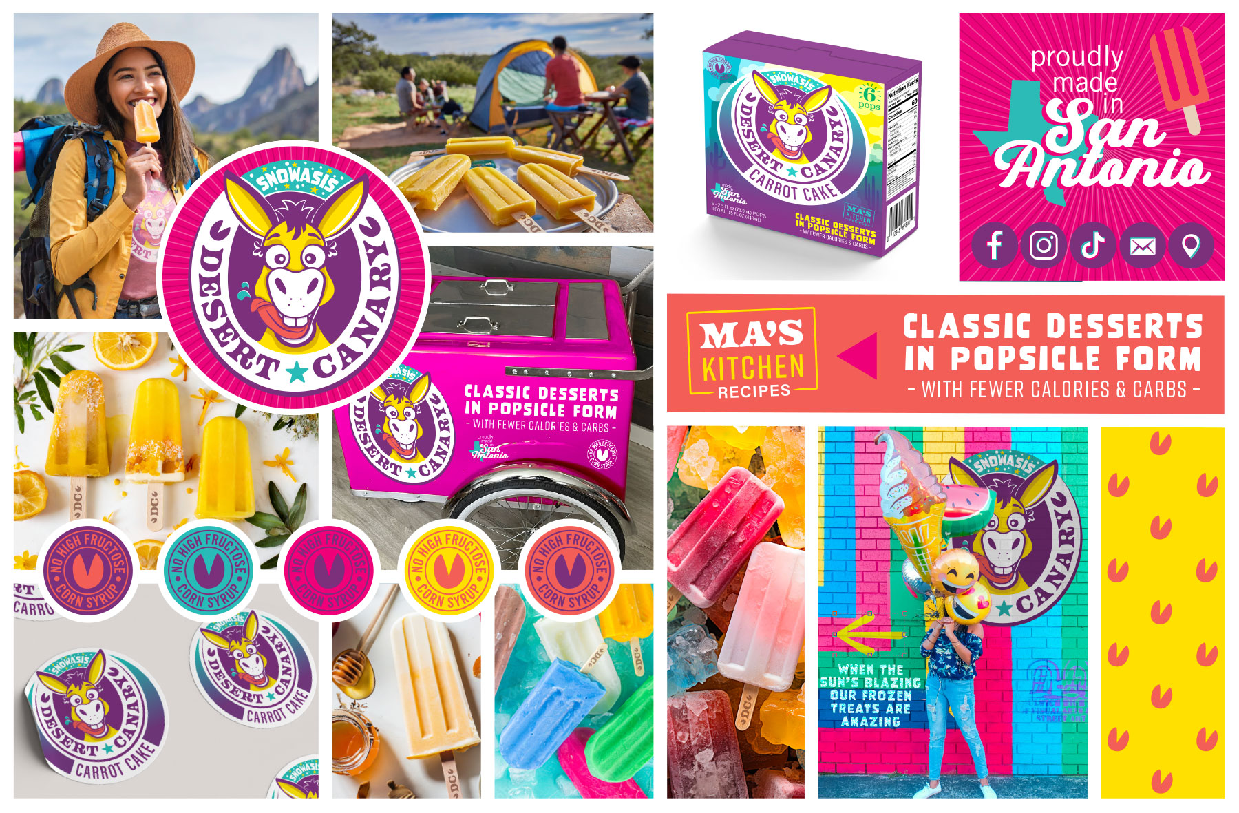
LIMIT YOUR PALETTE
While it can be tempting to use a rainbow of colors, limiting your palette between 2-3 primary colors for your brand makes it more identifiable. You can consider other secondary shades for your website or promotional materials, but your primary brand colors should be consistent across all channels.
CREATE A BRAND MOOD BOARD
A mood board is a collection of samples or digital images representing the look and feel of a brand. Including examples of color palettes, fonts, images, and even keywords can be a playful and effective way to visualize your brand.
TEST & SEEK FEEDBACK
Lastly, don’t hesitate to test your color palette and seek feedback to ensure it resonates with your audience and aligns with your brand identity. With digital tools now available, you can easily test various color combinations and schemes before finalizing.
Finding the perfect color palette is like discovering the secret sauce that makes your brand stand out. At StellaKinesis Design, we believe in creating brand aesthetics with powerful psychological undertones, encapsulated in intuitive color palettes. After all, a well-curated color palette is worth a thousand words!
Remember, your brand's colors are not just aesthetic choices – they are communication tools that carry the weight and identity of your brand's message. Choose wisely!